之前matplotlib繪製折線圖如果同時選取2筆Y軸的資料
listy1.append(eval(list2[1]))
listy2.append(eval(list2[4]))
plt.plot(listx1, listy1, label="美元/新台幣")
plt.plot(listx1, listy2, label="美元/日幣", color='red',linewidth=1.0,linestyle='--')
 1
 2
 3
 4
 5
 6
 7
 8
 9
10
11
12
13
14
15
16
17
18
19
20
21
22
23
24
25
26
27
28
29
30
31
import requests
html = requests.get("https://www.taifex.com.tw/data_gov/taifex_open_data.asp?data_name=DailyForeignExchangeRates")
html.encoding="CP950"
print(html.text)

#切割換行
list1=html.text.split("\r\n")
print(list1)
listx1=[]
listy1=[]
listy2=[]
for i in range(1,len(list1)-1):
    list2=list1[i].split(",")
    # print(list2[0]+","+list2[1])
    listx1.append("{}/{}".format(list2[0][4:6],list2[0][6:8]))
    listy1.append(eval(list2[1]))
    listy2.append(eval(list2[4]))

#print(listy2)

##引用matplotlib繪製折線圖
import matplotlib.pyplot as plt
import matplotlib as mpl

mpl.rcParams['font.sans-serif'] = ['FangSong']
mpl.rcParams['axes.unicode_minus'] = False

plt.plot(listx1, listy1, label="美元/新台幣")
plt.plot(listx1, listy2, label="美元/日幣", color='red',linewidth=1.0,linestyle='--')
plt.legend() #設置圖例  不帶參數調用 legend 會自動獲取圖例控制碼及相關標籤
plt.show()
1 2 3 4 5 6 7 8 9 10 11 12 13 14 15 16 17 18 19 20 21 22 23 24 25 26 27 28 29 30 31 | import requests html = requests.get("https://www.taifex.com.tw/data_gov/taifex_open_data.asp?data_name=DailyForeignExchangeRates") html.encoding="CP950" print(html.text) #切割換行 list1=html.text.split("\r\n") print(list1) listx1=[] listy1=[] listy2=[] for i in range(1,len(list1)-1): list2=list1[i].split(",") # print(list2[0]+","+list2[1]) listx1.append("{}/{}".format(list2[0][4:6],list2[0][6:8])) listy1.append(eval(list2[1])) listy2.append(eval(list2[4])) #print(listy2) ##引用matplotlib繪製折線圖 import matplotlib.pyplot as plt import matplotlib as mpl mpl.rcParams['font.sans-serif'] = ['FangSong'] mpl.rcParams['axes.unicode_minus'] = False plt.plot(listx1, listy1, label="美元/新台幣") plt.plot(listx1, listy2, label="美元/日幣", color='red',linewidth=1.0,linestyle='--') plt.legend() #設置圖例 不帶參數調用 legend 會自動獲取圖例控制碼及相關標籤 plt.show() |
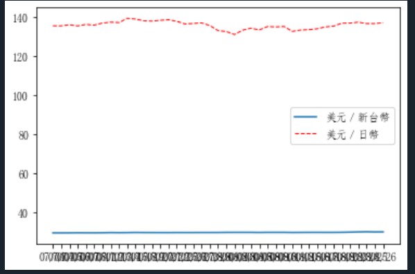
由於Y軸數據差距太大會變成這樣,一開始還以為是設定錯誤…
爬文之後找幾種共用X軸的方式
1.subplot()+twinx()
plt.figure()
ax1 = plt.subplot()
ax2 = ax1.twinx() #共用X軸

ax1.plot(listx1,listy1,'b-', label="美元/新台幣")
ax1.set_xlabel('日期') # 设置x坐标轴
ax1.set_ylabel('美元/新台幣', color='b') # 设置y1坐标轴

ax2.plot(listx1,listy2,'r-', label="美元/日幣")
ax2.set_ylabel('美元/日幣', color='r') # 设置y2坐标轴

ax1.legend()
ax2.legend()

plt.show()
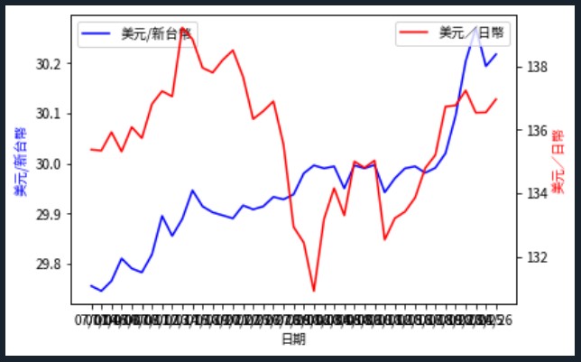
調整X軸
方法1) ax1.set_xticks([0,10,20,30,40,50])
方法2)ax1.set_xticklabels(listx1,rotation=”vertical”,fontsize=”small”)
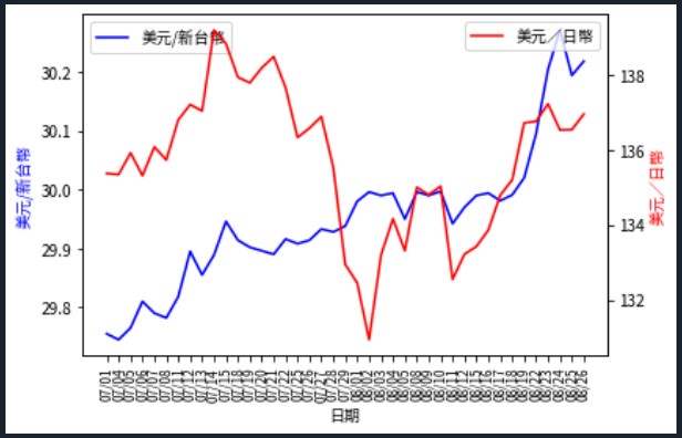
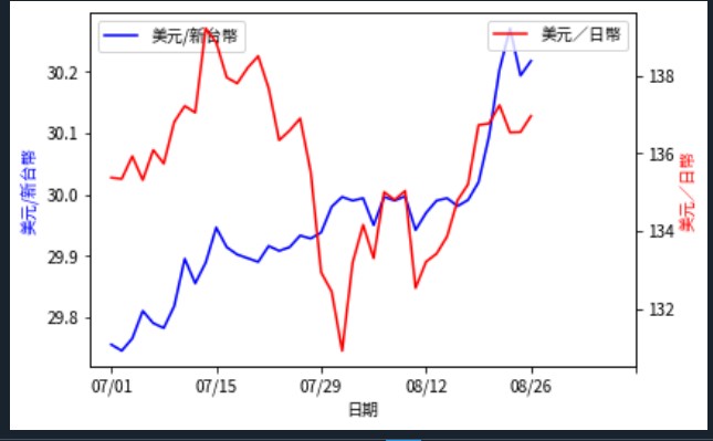
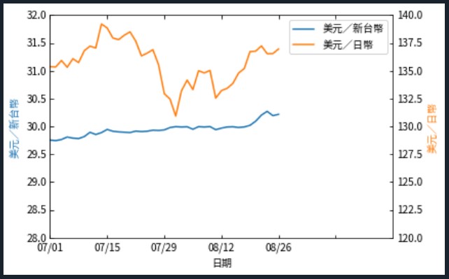
2.host_subplot+twinx()
import matplotlib.pyplot as plt
import matplotlib as mpl
from mpl_toolkits.axes_grid1 import host_subplot
from mpl_toolkits import axisartist

mpl.rcParams['font.sans-serif'] = ['Source Han Sans TW'] # 調整字型為 思源黑體
mpl.rcParams['axes.unicode_minus'] = False


host = host_subplot(111, axes_class=axisartist.Axes)
par1 = host.twinx()

par1.axis["right"].toggle(all=True)


p1, = host.plot(listx1,listy1, label="美元/新台幣")
p2, = par1.plot(listx1,listy2, label="美元/日幣")


host.set_xlim(0, 60)
host.set_ylim(28, 32)
par1.set_ylim(120,140)

host.set_xlabel("日期")
host.set_ylabel("美元/新台幣")
par1.set_ylabel("美元/日幣")
host.set_xticks([0,10,20,30,40,50])
host.legend()

host.axis["left"].label.set_color(p1.get_color())
par1.axis["right"].label.set_color(p2.get_color())

plt.show()

0 comments:
張貼留言